
The world today revolves around mobile devices. If you were to walk down the street in a major city, you would probably see hundreds of people staring into their smartphones or tablets. Now, many in these numbers are going to be on the internet or reading what their favourite websites have to say. With this scene in mind, you can most likely now understand how critical it is to consider mobile devices when you are considering web design. One of the best ways to do this is to use responsive design techniques. What Is a Responsive Web Design? Basically, a responsive website is one that renders differently on different-sized devices. Using responsive CSS code (or a website builder or template with responsive design built-in), you will be able to create a versatile website that looks great on pretty much any phone, tablet, computer, or other device. To put things simply, an optimised website is one that will respond to a user, the device they are using and their actions. In some cases, different elements will be displayed in different positions on different devices. Similarly, some elements could be absent altogether on the mobile version of your website.

Any business which has an online presence will almost certainly do so using a website. With so many templates now available you could literally have one up and running in a day. However, contrary to the mantra, ‘build it and they will come’, without an effective design, proper website development, and conversion factors addressed, you will struggle for traffic. More importantly, any traffic you do get, will not take the desired actions you hope for. Web design and development consist of a multitude of principles and best practices, which sadly all too many businesses are unaware of, or simply do not know how to implement. This is why using a website development company to build or redesign your website is almost always the best route to take. One of the most important reasons is that they will be up to date and fully aware of the current best practices and guidelines, especially as they apply to SEO and ranking on Google. These guidelines could literally take up an entire book, however, there are some that take precedence.
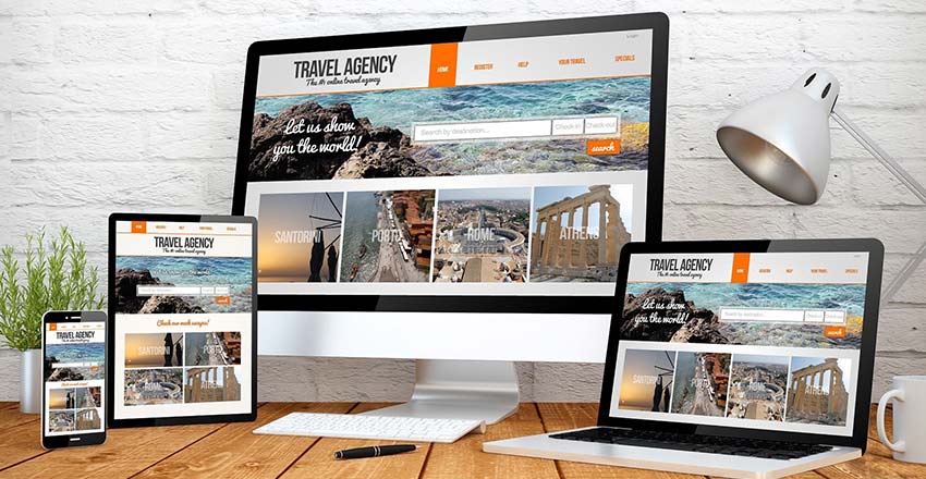
Responsive Web Design seems like nothing more than a fancy new buzzword being floated around a lot these days but really it is just talking about a concept that is simple in nature. It is all about making sure that everything on your website functions optimally across all the major devices through which people are accessing the internet nowadays. From the onset of the first iPhone back in 2007 to this day, the number of people using the internet through their phones has increased massively. Fast forward to 2018, the number of internet users through mobile has surpassed the number of internet users from desktop computers. This is why the aspect of Responsive Web Design isn’t just a new term, it is a necessary concept that needs to be adopted by every business. Here is a look at the 4 reasons why you need responsive web design. Good for SEO Rankings One of the foremost reasons why businesses even have websites is to leverage the power of the internet and gain relevant exposure to an online audience. Keeping that in mind, they know that ranking high on SEO is crucial for their success. The best search engine is Google and there is little left to debate that fact. The primary focus for Google is to provide the best possible user experience to people using their platform. That’s why Google evaluates your website based on the usability of your website through a varying range of devices. Having a responsive web design makes your website easily accessible across all devices and the top results from any Google search have that part of their web design sorted out.
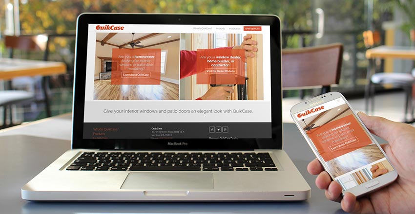
If you spend a lot of time in the digital world then you’ve probably heard of the term “responsive website” but understanding exactly what it means can be tricky for some people to understand, and makes a huge difference in generating traffic and sales to your business. Responsive websites have become the new buzzword in today’s world of mobile web browsing where users visit websites on all different devices, from their desktop computers to iPads to their iPhone.

We have a new age of handheld mobile devices, including smartphones, ipads, and tablets. Yet many of our design ideas continue to be inspired by the old-world Internet. That era of users was a population that engaged entirely through computers and laptops. They had so much time on their hands.


