

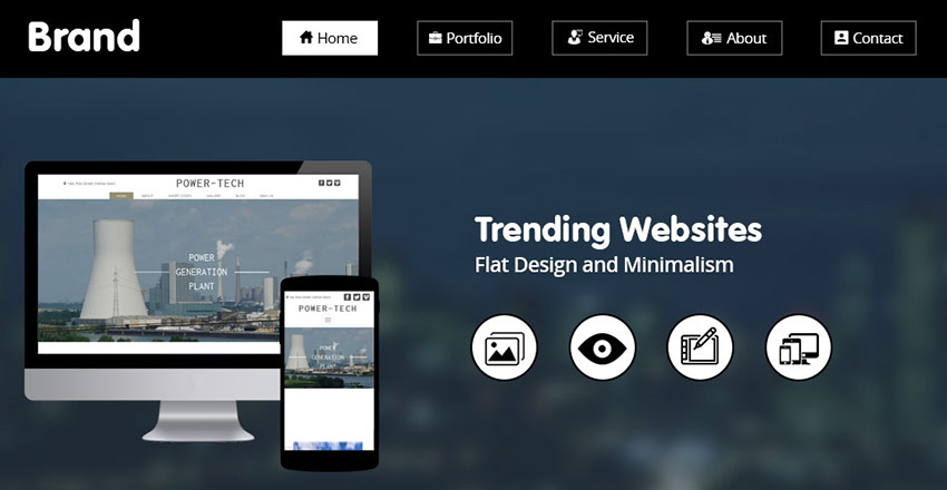
The latest trend in web design is minimalism and flat design. By “flat,” we mean plain, unadorned buttons, links, and menus. No raised edges or drop shadows.No fancy borders or glassy icons.
If the forms on your site look this way, congratulations — you’re part of the latest hip design trend! But you have to be careful. Everything comes at a risk.
You don’t want to chase away customers when you simplify the visuals too much.
What We Consider Great Web Design Constantly Changes And Evolves
Audience tastes, behavior trends, etc., all play a role in changing what we see as great website design.
The latest design trend that’ everyone is talking about is minimalism, where you remove the extra bells and whistles on a website, and make it as clean and simple as possible.
But many times, small businesses have jumped onto the trend to find that the website their team created has somehow crossed over from being minimalist and impactful to unrefined, raw, and even unsophisticated.
Minimalist web design, if not executed correctly, can become a landmine.
You’re committed to simplifying your website to the bare minimum, but everything in moderation is the way to go.
It’s easy to fall off the edge if you don’t approach minimalist design with discipline and self-restraint. You’re reducing the excess, wanting to achieve more with less on the website.
You’re creating a simpler interface for your customers and clients, and as a result, getting the results you need in the form of conversions. If you want to practice high-quality minimalism, there has to be a balance between usability and style.
The Benefits of Minimalist Design
Let’s break down the many pros up for grabs by attaining a sophisticated balance of design and practicality.
One, easier navigation. This is hands down the most impressive feat to achieve. You create a minimalist website that’s stylish while being high on the usability scale — that’s always a win. But is it easy?
Today, visitors barely have time to find you and sign up for the product or service you are offering. Life is busy, everyone is managing a thousand things every second.
Moreover, options available to users at their fingertips are so excessive, it only takes a second for them to go “I’m out” and click on that competitor’s website instead.
More customers than ever before are jumping ship. It’s hard to maintain brand loyalty, which makes customers come back for more. If they find something better in the next search result, you’re history. It’s that fast.
We don’t want that for your small business, so we make things super easy. No complications, no tough questions or forms. Let’s not put visitors in a position where they have to figure things out.
The basic go-to design steps are as follows:
Incorporate white space, photos, and get those eyes drawn to what matters — calls to action. Just like smaller, simpler menus at a restaurant make ordering easier, give the visitor less choices.
Now, navigation is simpler, cleaner, and results get achieved faster. It’s a win-win.
Another great benefit of the ‘less is more’ approach is faster load times. With fewer extras on the page pulling your website down, the pages load faster.
The result is a happier visitor, who’s glad their time is valued — not wasted. And, they can be in and out in a minute after making an order. Simple, and easy.
Remember that visitors today have abundant options and alternatives at their disposal. All it takes is a single tap on their screen.
Expecting users to wait for a page to load for even a fraction of a second is literally too much to expectat. They won;t wait. Your sales graphs will be painful to look at.
Minimalist websites load faster, keep visitors happy, and drive results for your business.
Everything that shows up for a user on the website interface is actually code.
This code exists on the backend. The more clutter and design and text and images, the greater the amount of code dragging the website down. Less code, and your website loads faster, is more efficient, but is also great for SEO. Search engine algorithms crawl your website code to read the website, and understand what it’s about.
This code speaks to the algorithm to communicate what your business offers. Now, a design that is simple, clean, and minimalist is easier to read by search engines. It’s important to remember that faster load times also enhance your SEO, as does a lower bounce rate.
Other great benefits to mention here would be lower maintenance websites, as the absence of flashy elements, plugins, and applications reduces the probability of breakdowns.
You might also not need to update the website design as frequently when you have a minimalist website. The design elements will age better, and the style does not become outdated easily.
Most of the website elements and styles are trendy current fads that work. But when you have a minimal design concept, you’re not fitting in with a trendy standard.
Instead, you’re upgrading the quality of elements, using clearer text, font, and images to drive traffic and drive conversions for your business. What’s even better, a hip, simple website makes more of an impact, is easier to remember, and makes a statement.
The benefits of minimalist design are ample, but the approach isn’t suited to every type of business industry. Simplicity is important, and your content will stand out in ways a busier, heavily-designed website might not bring you.
An Example: Balancing Minimalist Style With Usability
An article at A List Apart talks about just the sort of case we’re making here. For instance, they use the example of two actions on a form, ‘submit’ and ‘cancel’, which look identical.
But to someone in a hurry who doesn’t want to think too hard, the two have been made visually distinct by giving the default action a different color. This design style gives a small cognitive nudge.
True, you don’t want to distract the user with a bunch of whistles and bells. But, as that article is pointing out, we might have swung too far the other way.
We have to be careful that we don’t take information away from the user. We should always remember, particularly with doing business on the web, that making the process as easy and quick to navigate as possible helps increase conversions.
Another example used is a function in a flat bar, as opposed to a rounded oval box that makes it obvious that it’s a button. Once again, we provide just that light cognitive nudge as a cue to the user on what to do.
This is especially helpful on the mobile platform, where precise mouse actions are replaced with big, clumsy finger swipes. Giving the user a better target helps them aim for the right action.
One key test is to try using a form on your site yourself. If you can see where somebody would possibly get frustrated using it, it’s a good idea to consider getting it changed.
Conclusion
We have some important takeaways here. If your business type and industry can pull it off, go for a minimalistic website.
The benefits we talk about above, such as better SEO, faster load times (which also improve seo), better navigation (also — better seo) and higher recall for the customer, are great perks to have. But the trick is to stay disciplined.
We’re taking away the extras, not the essentials. It still needs to look complete, well-polished, sophisticated — so let’s not go overboard.
Evaluate the type of business you’re running. Do you have complex product lines that can’t be placed in a minimalist website?
Is your offer a wide array of services, or a mix of them, that can vary by bits and pieces and make each offer completely different? You might need a moment to think that through.
If you have your heart set on it, you can still aim for a minimalist design. But it may or may not be able to communicate your business message as effectively.
Wondering whether this design trend might not be for you? Sit down with an expert web designer.
What have you goto to lose? You never know, expert minimalist website designers might be able to curate something amazing for your business.
We all love a minimalist website, and exploring your options can be a great business move.
A timeless website that’s easy to scale and maintain? It can’t get any better than this. Balance usability and style, and you’ve got yourself a winner.